
Introduction
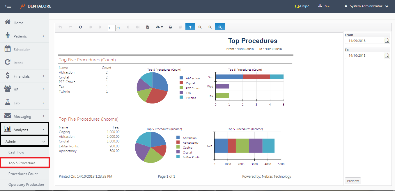
Top 5 Procedure Report:
- Displays the Top 5 procedures over the clinic level (For all Branches) according to their Count and Income, each in separate graph.
- Report displays Data over the Last Month by default.
- Data displayed in different formats: Pie Chart, Bar Chart and Table for each of the Count section and Income Section.
- Count and Income of Procedures in the 2 sections are displayed in a Descending order.
(Top 5 Procedure) report could be accessed from:
- Analytics >> Admin >> Top 5 Procedure.
Filtration
User has the ability to filter data within required period of time from:
- Date Range
- (From) and (To) fields in the filtration Area in which date filtration depends on the Completion Date of displayed Procedures.
Content
Report's body is divided in 2 Sections; one for the Procedure's Count and the other for Procedure's Income.
1- Top 5 Procedures based on Count
- Procedures displayed in this section according to their Completion Date. So procedures will only be counted if it's of status: Completed.
- Table of Procedures display the Name of Procedure and Count of how many times this procedure has been performed within the selected date range.
- Pie Chart of Procedures Count displays each procedure with different color and Color code shows the name of each procedure equivalent to it's color.
- Horizontal Bar Chart displays the count of each procedure vs. when this procedure has been performed through the selected date range.
2- Top 5 Procedures based on Income
- Income in this report refers to the (Fees) of the Procedure.
- Procedures displayed in this section according to their Completion Date. So procedures will only be taken in consideration if it's of status: Completed.
- Table of Procedures display the Name of Procedure and Total Fees of this procedure within the selected date range.
- Pie Chart of Procedures Fees displays each procedure with different color and Color code shows the name of each procedure equivalent to it's color.
- Horizontal Bar Chart displays the Fees of each procedure vs. when this procedure has been performed through the selected date range.