
Analytics Dashboard displays summary for some statistical data related to your clinic.
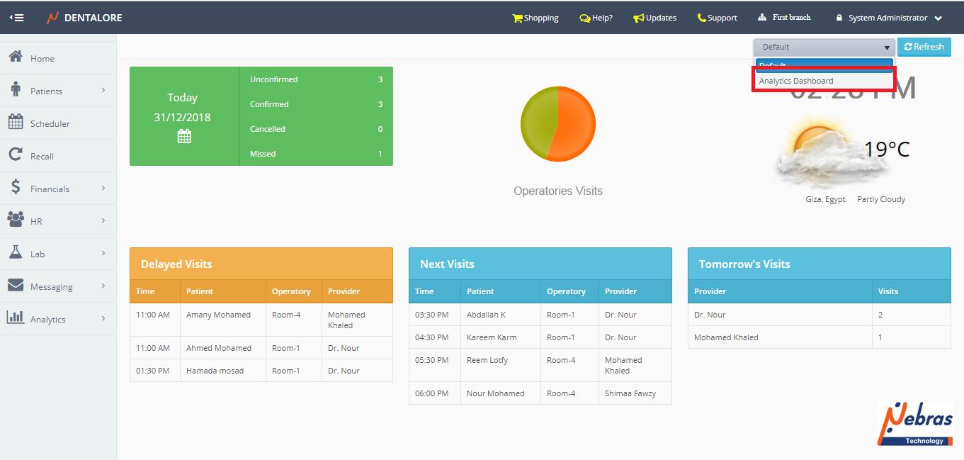
To Open the analytical dashboard: From 'Home' page, Open the "Dashboards" drop down menu and select "Analytical Dashboard".
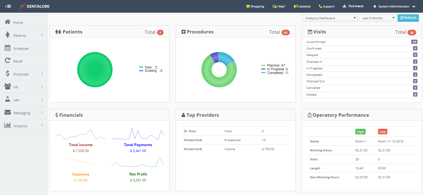
"Analytical Dashboard" displays statistical data in 6 sections and has a filtration area to display data within required period of time.
>> Note that: Data displayed in Analytical dashboard is per branch.
1- Filtration Area
- User has the ability to filter data using the drop down menu existing at the upper right side of the view. Available periods are: (Yesterday, Last Week, Last Month, and Last 3 Months).
- Default Selection is: Yesterday.
2- Statistical Data
- Patients Section- Pie Chart displays the Count of new and existing Patients who have completed at least one visit within the selected period.
- Total Number of patients (New and Existing) displayed on the chart is displayed at the section's header.>> Note: Patients who have completed at least one visit before the date range this is considered an existing patient. - Procedures Section
- Pie Chart displays the count of all procedures with statuses: (Planned, In Progress, Completed) within the selected period.
- Data displayed according to:
-- Creation Date of Planned Procedures.
-- Start Date of In progress Procedures.
-- Completion Date of Completed Procedures.
- The (Total) number of each of the planned, in progress, and completed procedures is displayed beside the pie chart. - Visits Section
- Section displays the total count of visits with different status: (Unconfirmed, confirmed, Delayed, Checked In, In Progress, Completed, Checked Out, Cancelled, and Missed) within the selected period of time. - Financials Section
- Displays the total for each of the following:
1- Total Income
- Line Chart displays the total income amount within the selected period of time.
>> Total income = Total fees for (Completed and In progress) procedures.
2- Total Payment
- Line Chart displays the total actual payment amount (Insurance payment & Patients payment ) for all procedures within the selected period of time.
3- Expenses
- Line Chart displays the total expenses of clinic within the selected period of time.
4- Net Profit
- Line Chart displays the net profit within the selected period of time.
>> Net Profit = Total Actual Payments - Total Expenses.
- Top Providers Section
- Section displays the top providers in your clinic according to 3 parameters:
-- Visits; Displays the name of top provider according to the (Completed and In Progress) visits made by him/her.
-- Income; Displays the name of top provider according to the fees of (Completed and In Progress) procedures performed by him/her.
-- Procedures; Displays the name of top provider according to the total number of (Completed and In Progress) procedures. - Operatory Performance Section
- Section displays data of both the highest and lowest rooms in your clinic. Points of comparison for each of the high and low performance operatories are: (Working Hours/Non-working Hours, visits, and Length of visits).
- Data displayed for each operatory are:
-- Name
-- Working Hours; Displays the total working hours of the operatory within the selected period.
-- Visits; Displays the total count of visits performed in the opereratory within the selected period.
-- Lenght; Displays the total length for all visits done in the opereratory within the selected period.
-- Non-Working Hours; Displays the total non-working hours of the opereratory within the selected period.